Views 370
Clean Bento Grid UI for Websites

Clean Bento Grid UI for Websites – A Bento Grid UI is a visually appealing, modular layout design inspired by Japanese bento boxes. It divides content into neat, customizable sections, making it ideal for displaying diverse information or elements such as portfolios, galleries, blogs, or services. Below is an explanation and example of a clean Bento Grid design you can use for websites.
Clean Bento Grid UI for Websites
SportsWare
Graphic Tees

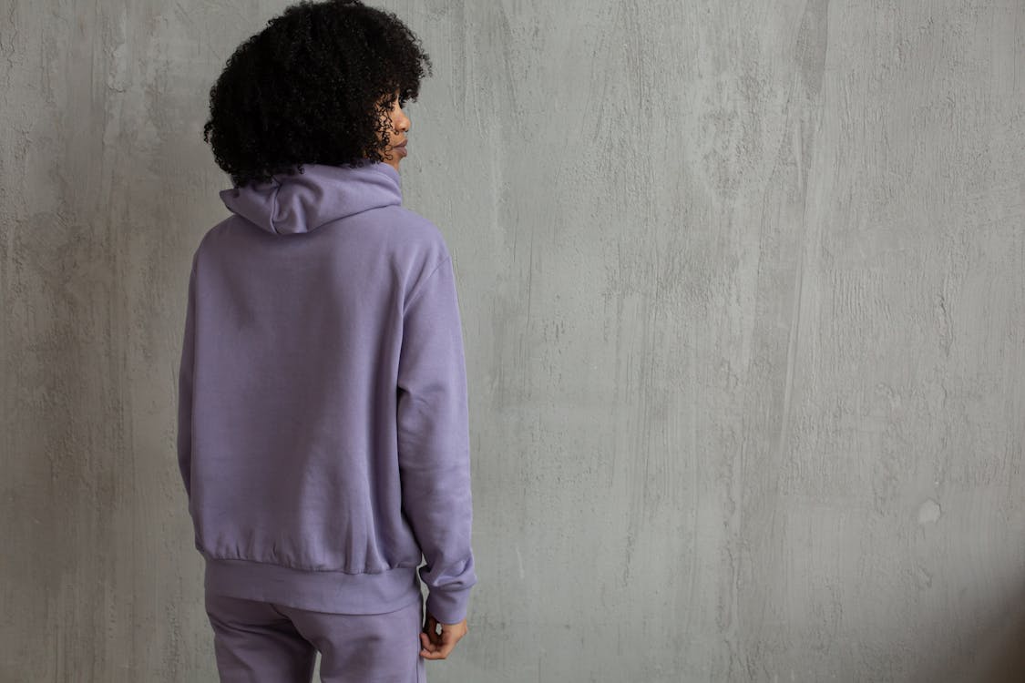
Ladies Hoodies

Ladies Shirts
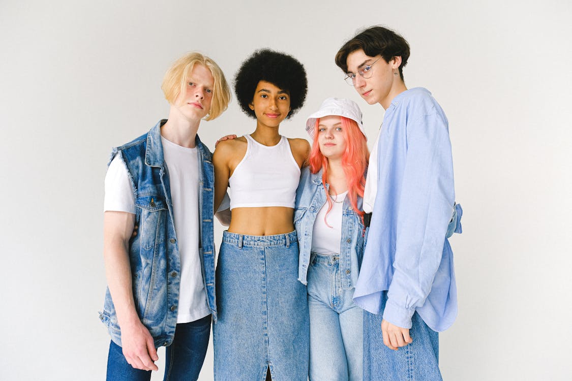
Youth Fashion
Kids Fashion

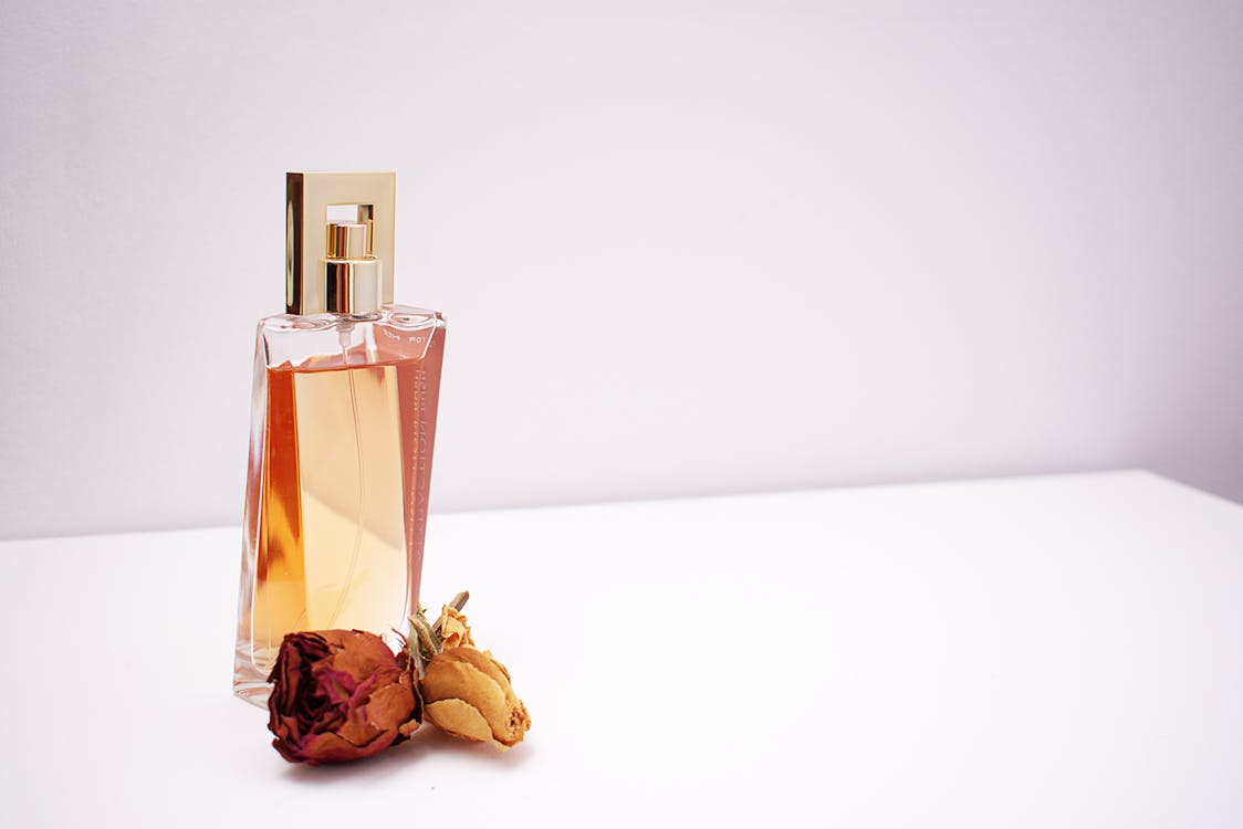
Perfume & Colgne
Mens Shirts

Adult Braces
BANNER
Credits for bolson
Clean Bento Grid UI for Websites
<div class="customwrapper">

  <a href="#" style="--grid-area:cat-sport">
    <p class="align-right">SportsWare</p>
    <img src="https://images.pexels.com/photos/6311237/pexels-photo-6311237.jpeg?auto=compress&cs=tinysrgb&w=1260&h=750&dpr=1">
  </a>

  <a href="#" style="--grid-area:cat-tees">
    <p>Graphic Tees</p>
    <img src="https://images.pexels.com/photos/5592602/pexels-photo-5592602.jpeg?auto=compress&cs=tinysrgb&w=1260&h=750&dpr=1">
    </a>

  <a href="#" style="--grid-area:cat-hoodies">
    <p>Ladies Hoodies</p>
    <img src="https://images.pexels.com/photos/6995870/pexels-photo-6995870.jpeg?auto=compress&cs=tinysrgb&w=1260&h=750&dpr=1">
  </a>

  <a href="#" style="--grid-area:cat-ladies-shirt">
    <p>Ladies Shirts</p>
    <img src="https://images.pexels.com/photos/720606/pexels-photo-720606.jpeg?auto=compress&cs=tinysrgb&w=1260&h=750&dpr=1">
  </a>

  <a href="#" style="--grid-area:cat-youth">
    <p>Youth Fashion</p>
    <img src="https://images.pexels.com/photos/5325710/pexels-photo-5325710.jpeg?auto=compress&cs=tinysrgb&w=1260&h=750&dpr=1">
  </a>

  <a href="#" style="--grid-area:cat-kids">
    <p>Kids Fashion</p>
    <img src="https://images.pexels.com/photos/4715329/pexels-photo-4715329.jpeg?auto=compress&cs=tinysrgb&w=1260&h=750&dpr=1">
  </a>

  <a href="#" style="--grid-area:cat-cologne">
    <p class="align-right">Perfume & Colgne</p>
    <img src="https://images.pexels.com/photos/1190829/pexels-photo-1190829.jpeg?auto=compress&cs=tinysrgb&w=1260&h=750&dpr=1">
  </a>

  <a href="#" style="--grid-area:cat-mens-shirts">
    <p>Mens Shirts</p>
    <img src="https://images.pexels.com/photos/19606373/pexels-photo-19606373/free-photo-of-smiling-men-in-shirts-standing-together-at-sunset.jpeg?auto=compress&cs=tinysrgb&w=1260&h=750&dpr=1">
  </a>

  <a href="#" style="--grid-area:cat-intimate">
    <p>Adult Braces</p>
    <img src="https://images.pexels.com/photos/4715329/pexels-photo-4715329.jpeg?auto=compress&cs=tinysrgb&w=1260&h=750&dpr=1">
  </a>

  <a href="#" style="--grid-area:banner" class="banner">
    BANNER
  </a>

</div>

<style>
.customwrapper{
  width: min(calc(100% - 1rem), 1240px);
  margin: 2rem auto;

  display: grid;
  gap: 1rem;
  grid-auto-rows: 200px;
  grid-template-columns: 1fr;
   grid-template-areas:
        "cat-tees"
        "cat-sport"
        "cat-intimate"
        "cat-cologne"
        "cat-kids"
        "cat-hoodies"
        "cat-youth"
        "cat-ladies-shirt"
        "cat-mens-shirts"
        "banner";

}

@media (min-width: 400px){
  .customwrapper{
    grid-template-columns: 1fr 1fr;
    grid-template-areas:
        "cat-tees         cat-tees"
        "cat-tees         cat-tees"
        "cat-sport        cat-sport"
        "cat-sport        cat-sport"
        "cat-intimate     cat-cologne"
        "cat-kids         cat-kids"
        "cat-kids         cat-kids"
        "cat-hoodies      cat-hoodies"
        "cat-youth        cat-youth"
        "cat-youth        cat-youth"
        "cat-ladies-shirt cat-mens-shirts"
        "cat-ladies-shirt cat-mens-shirts"
        "banner           banner";
  }
}
@media (min-width: 600px){
  .customwrapper{
    grid-template-columns: repeat(6, 1fr);
    /* we have to define the area for each of the columns, even if it is the same, so, if an element covers 3 columns, we have to define it 3 times, once for each column - this is where grid-lines would be easier */
    grid-template-areas:
      "cat-tees         cat-tees          cat-tees          cat-tees        cat-tees        cat-tees"
      "cat-tees         cat-tees          cat-tees          cat-tees        cat-tees        cat-tees"
      "cat-sport        cat-sport         cat-sport         cat-sport       cat-kids        cat-kids"
      "cat-sport        cat-sport         cat-sport         cat-sport       cat-kids        cat-kids"
      "cat-hoodies      cat-hoodies       cat-hoodies       cat-hoodies     cat-hoodies     cat-hoodies"
      "cat-youth        cat-youth         cat-youth         cat-youth       cat-intimate    cat-intimate"
      "cat-youth        cat-youth         cat-youth         cat-youth       cat-cologne     cat-cologne"
      "banner           banner            banner            banner          banner          banner"
      "cat-ladies-shirt cat-ladies-shirt  cat-ladies-shirt  cat-mens-shirts cat-mens-shirts cat-mens-shirts"
      "cat-ladies-shirt cat-ladies-shirt  cat-ladies-shirt  cat-mens-shirts cat-mens-shirts cat-mens-shirts"
      "cat-ladies-shirt cat-ladies-shirt  cat-ladies-shirt  cat-mens-shirts cat-mens-shirts cat-mens-shirts"
      ;

  }
}
@media (min-width: 800px){
  .customwrapper{
    grid-auto-rows: 200px;
    grid-template-columns: repeat(4, 1fr);
    grid-template-areas:
      "cat-sport        cat-tees  cat-tees    cat-hoodies"
      "cat-ladies-shirt cat-tees  cat-tees    cat-youth"
      "cat-ladies-shirt cat-kids  cat-cologne cat-cologne"
      "cat-intimate     banner    banner      cat-mens-shirts";
   }

}
.customwrapper > *{
  grid-area: var(--grid-area);
  position: relative;
  color: black;
  overflow: hidden;
  border-radius: 10px;
  text-decoration: none;
}
.customwrapper > a::after{
    content: '';
    position: absolute;
    inset: 0;
    background-image: linear-gradient(to bottom, rgba(0 0 0 / .25), transparent 25%);
}

.customwrapper > *:hover > img{
  scale: 1.2;
  rotate: 4deg;
}

.customwrapper > * > p{
  position: absolute;
  /*max-width: 12ch;*/
  text-wrap: balance;
  top: .75rem;
  left: .75rem;
  font-size: .9rem;
  z-index: 2;

}
.customwrapper > * > p.align-right{
  left: auto;
  right: .75rem;
  text-align: right;
}
.customwrapper img{
  max-width: 100%;
  width: 100%;
  height: 100%;
  display: block;
  border-radius: 10px;
  object-fit: cover;
  transition: scale 1000ms ease-in-out, rotate 1000ms ease-in-out;
}
.banner{
  background: #FFEDD5;
  border-radius: 10px;
  display: grid;
  place-content: center;
}


:root {
  --clr-bg: #222;
  --clr-primary: #f5f5f5;
  --clr-secondary: #075985;
}


</style>
Njoy frontend developers. Read my Automatic tab switching component with html css js