Views 483
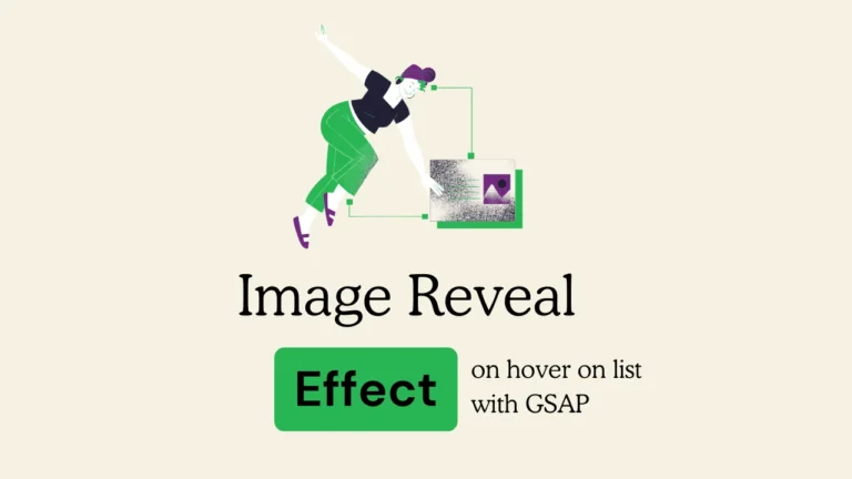
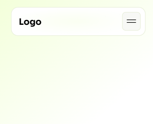
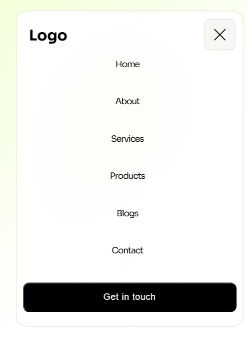
Create an Expanding Mobile Nav with Gsap – HTML, CSS & Js

Create an Expanding Mobile Nav with Gsap – HTML, CSS & Js :- Expanding a mobile navigation menu can enhance the user experience and boost engagement. By incorporating unique styles into your website, you can create a more visually appealing and high-converting design. Below is a code snippet for creating an expanding mobile navigation menu using GSAP:
Github Link – Code Expanding Mobile nav code here
Create an Expanding Mobile Nav with Gsap – HTML, CSS & Js
These Expanding menu made for Mobile screens
<!doctype html>
<html lang="en">
<head>
<meta charset="UTF-8" />
<meta name="viewport" content="width=device-width, initial-scale=1.0" />
<script src="https://cdnjs.cloudflare.com/ajax/libs/gsap/3.11.1/gsap.min.js"></script>
<script src="https://cdnjs.cloudflare.com/ajax/libs/gsap/3.11.1/ScrollTrigger.min.js"></script>
<style>
@import url('https://fonts.googleapis.com/css2?family=Sora:wght@400;600;700&display=swap');
body {
background: linear-gradient(139deg, var(--token-ba45ae08-0354-45a4-88d7-90a247ed9082, #fff2d1) -13.075846201039035%, var(--token-d49ce14e-f5dc-463a-9b8d-4f0e772df7f1, rgb(255, 255, 255)) 55.00000000000001%);
font-family: 'Sora', sans-serif;
--token-ba45ae08-0354-45a4-88d7-90a247ed9082: rgb(240, 255, 209);
--token-d49ce14e-f5dc-463a-9b8d-4f0e772df7f1: rgb(255, 255, 255);
width: 100%;
height: 100vh;
}
/* ==== < HEADER STYLES > ==== */
.Custom-header{
display:flex;
justify-content:space-between;
align-items:center;
width:100%;
max-width:1340px;
height:100px;
margin:0 auto;
}
.logo-class{
color:white;
width: 150px;
height: auto;
transform-style: preserve-3d;
transition: transform .3s;
}
.logo-class:hover {
transform: scale3d(.92, .92, 1.01);
}
nav {
height: 2rem;
width: 20rem;
border-radius: 1.2rem;
position: fixed;
top: 3vw;
right: 3vw;
padding: 20px;
z-index: 100;
background: radial-gradient(50% 50% at 50% 50%, rgba(255, 255, 255, 0.4) 0%, rgb(255, 255, 255) 100%);
transform-origin: 50% 50% 0px;
backdrop-filter: blur(5px);
background: radial-gradient(50% 50% at 50% 50%, rgba(255, 255, 255, 0.4) 0%, rgb(255, 255, 255) 100%);
border: 2px solid rgb(234, 240, 221);
}
@media(max-width:500px){
.Custom-header{
}
nav {
top: 5vw;
padding: 10px 10px 10px 10px;
width: 80%;
height: 3.5rem;
margin: 0 auto; /* Center horizontally */
left: 50%;
transform: translateX(-50%);
}
nav .button {
height: 4rem;
width: 4rem;
border-radius: 5rem;
border: 0;
outline: 0;
top: 12px !important;
right: 12px !important;
position: absolute;
cursor: pointer;
}
.logo{
position: absolute;
top: 0;
left: 20px;
font-size: 24px;
}
}
nav .button {
height: 3rem;
width: 3rem;
border-radius: 5rem;
border: 0;
outline: 0;
top: 3px;
right: 3px;
position: absolute;
cursor: pointer;
background-color: rgb(247, 248, 245);
border-radius: 10px;
transform: none;
transform-origin: 50% 50% 0px;
border: 2px solid rgb(234, 240, 221);
}
nav .button #toggleButtonLine1 {
content: "";
border: 1px solid #000;
width: 50%;
top: 42.5%;
left: 50%;
position: absolute;
transform: translate(-50%, -50%);
border-radius: 100px;
}
nav .button #toggleButtonLine2 {
content: "";
border: 1px solid #000;
width: 50%;
top: 57.5%;
left: 50%;
position: absolute;
transform: translate(-50%, -50%);
border-radius: 100px;
}
nav ul {
height: 90%;
width: 100%;
display: flex
;
align-items: center;
justify-content: space-evenly;
flex-direction: column;
padding-bottom: 0 !important;
padding-top: 40px;
padding-left: 0;
visibility: hidden;
opacity: 0;
padding-bottom: 0 !important;
gap: 2rem;
}
nav ul li {
width: 100%;
font-size: 14px;
font-weight: 500;
letter-spacing: -1px;
list-style: none;
display: flex;
align-items: center;
justify-content: center;
transform-style: preserve-3d;
transition: transform .3s;
}
nav ul li span {
display: inline-block;
scale: 0;
transition: all 200ms ease;
}
nav ul li a {
display: inline-block;
color: #080808;
text-decoration: none;
}
nav ul li a:hover{
color:#000;
}
nav ul li:hover {
font-weight: 1000;
transform: scale3d(.92, .92, 1.01);
}
nav ul li:hover span {
scale: 1;
}
/* =======> * Cursor Animation styles starts here * >===== */
.cursor {
position: fixed;
width: 40px;
height: 40px;
margin-left: -20px;
margin-top: -20px;
border-radius: 50%;
border: 2px solid #fff;
transition: 0.3s;
transform: translate(-50%, -50%);
pointer-events: none;
z-index: 1000;
}
.cursor2 {
position: fixed;
width: 4px;
height: 4px;
margin-left: -20px;
margin-top: -20px;
border-radius: 50%;
background-color: #fff;
transform: translate(-50%, -50%);
transition: 0.1s;
pointer-events: none;
z-index: 1000;
}
.grow,
.grow-small {
transform: scale(2.5);
background: white;
mix-blend-mode: difference;
border: none;
z-index:1001;
}
.grow-small {
transform: scale(2);
}
.grow-two,
.grow-small-two {
transform: scale(4);
background: white;
mix-blend-mode: difference;
border: none;
}
.grow-small-two {
transform: scale(2);
}
.cta{
position: relative;
width: 100%;
height: 48px;
margin: 0;
right: 0 !important;
top: 0 !important;
border-radius: 10px;
background-color: #000;
background: #000;
color: white;
letter-spacing: 0.8px;
font-weight: 500;
font-size: 14px;
}
</style>
</head>
<body class="your-body-class">
<div class="cursor"></div>
<div class="cursor2"></div>
<section class="Custom-header">
<div class="left-box">
<a href="/">
</a>
</div>
<div class="right-box">
<nav>
<a id="toggleButton" class="circle button">
<div id="toggleButtonLine1"></div>
<div id="toggleButtonLine2"></div>
</a>
<h3 class="logo">Logo</h3>
<ul class="menu cursor-scale">
<li><a href="#">Home</a> <span>●</span></li>
<li><a href="#">About</a><span>●</span></li>
<li><a href="#">Services</a><span>●</span></li>
<li><a href="#">Products</a><span>●</span></li>
<li><a href="#">Blogs</a><span>●</span></li>
<li><a href="#">Contact</a><span>●</span></li>
<button class="cta">Get in touch</button>
</ul>
</nav>
</div>
</section>
</body>
<script>
const nav = document.querySelector("nav");
const toggleButton = document.querySelector("#toggleButton");
const navMenu = document.querySelector(".menu");
const toggleButtonLine1 = document.querySelector("#toggleButtonLine1");
const toggleButtonLine2 = document.querySelector("#toggleButtonLine2");
console.log(toggleButtonLine1);
let isToggled = false;
toggleButton.addEventListener("click", function () {
// open the nav
if (isToggled === false) {
isToggled = true;
gsap.to(nav, {
duration: 0.3,
width: "80%",
height: "30rem",
zIndex: 1000,
ease: "ease-in(0.42, 0, 0.58, 1)",
borderRadius: "1.2rem",
paddingBottom: '20px',
opacity: 1,
delay: 0.1
});
gsap.matchMedia().add("(max-width: 768px)", () => {
gsap.to(nav, {
duration: 0.3,
width: "95% !important",
height: "35rem",
ease: "power2.inOut",
borderRadius: "1.2rem",
});
});
gsap.to("nav button", {
duration: 0.2,
top: "1vh",
right: "1vh",
ease: "power2.inOut",
});
gsap.to(toggleButtonLine1, {
duration: 0.2,
rotate: 45,
top: "50%",
left: "50%",
rotate: 45,
ease: "power2.inOut",
});
gsap.to(toggleButtonLine2, {
duration: 0.2,
top: "50%",
left: "50%",
rotate: -45,
ease: "power2.inOut",
});
gsap.to(navMenu, {
duration: 0.4,
visibility: "visible",
opacity: 1,
ease: "power2.inOut",
});
// close the nav
} else {
isToggled = false;
gsap.to(nav, {
duration: 0.3,
width: "80%",
height: "3.5rem",
ease: "power2.inOut",
paddingBottom: '10px',
borderRadius: "1.2rem",
});
gsap.to("nav button", {
duration: 0.4,
top: "5px",
right: "5px",
ease: "power2.inOut",
});
gsap.to(toggleButtonLine1, {
duration: 0.2,
rotate: 0,
top: "42.5%",
left: "50%",
rotate: 0,
ease: "power2.inOut",
});
gsap.to(toggleButtonLine2, {
duration: 0.2,
rotate: 0,
top: "57.5%",
left: "50%",
rotate: 0,
ease: "power2.inOut",
});
gsap.to(navMenu, {
duration: 0.2,
visibility: "hidden",
opacity: 0,
ease: "power2.inOut",
});
}
});
// cursor styles starts here
let cursor = document.querySelector(".cursor");
let cursor2 = document.querySelector(".cursor2");
let cursorScale = document.querySelectorAll(".cursor-scale");
let cursorScaletwo = document.querySelectorAll('.cursor-scale-two');
let cursorImage = document.querySelectorAll('.image-cursor');
let mouseX = 0;
let mouseY = 0;
gsap.to({}, 0.016, {
repeat: -1,
onRepeat: function () {
gsap.set(cursor, {
css: {
left: mouseX,
top: mouseY
}
});
gsap.set(cursor2, {
css: {
left: mouseX,
top: mouseY
}
});
}
});
window.addEventListener("mousemove", (e) => {
mouseX = e.clientX;
mouseY = e.clientY;
});
cursorScale.forEach((link) => {
link.addEventListener("mousemove", () => {
cursor.classList.add("grow");
if (link.classList.contains("small")) {
cursor.classList.remove("grow");
cursor.classList.add("grow-small");
}
});
link.addEventListener("mouseleave", () => {
cursor.classList.remove("grow");
cursor.classList.remove("grow-small");
});
});
cursorScaletwo.forEach((link) => {
link.addEventListener("mousemove", () => {
cursor.classList.add("grow-two");
if (link.classList.contains("small-two")) {
cursor.classList.remove("grow-two");
cursor.classList.add("grow-small-two");
}
});
link.addEventListener("mouseleave", () => {
cursor.classList.remove("grow-two");
cursor.classList.remove("grow-small-two");
});
});
cursorImage.forEach((link) => {
link.addEventListener("mousemove", () => {
cursor.classList.add("grow-two");
if (link.classList.contains("small-two")) {
cursor.classList.remove("grow-two");
cursor.classList.add("grow-small-two");
}
});
link.addEventListener("mouseleave", () => {
cursor.classList.remove("grow-two");
cursor.classList.remove("grow-small-two");
});
});
</script>
</html>
- How to Convert Image Upload png,jpg to Avif without Plugin
- Build a Modern Documentation Site in Minutes with This React & Vite Dashboard Template
- How I Built a Modern Hero Section with Next.js, Tailwind, and Framer Motion
- Build a Modern AI Chatbot with React, Next.js, and Gemini API
- New Hero Section Design Startups – With Elementor Template for Free
- Download This Free PersonalGPT Chat UI – Open Source Next.js Template
- How to Use Tailwind CSS Inside WordPress (Beginner-Friendly Guide)
- React Next.js Dashboard Boilerplate for Free
- How to Get Mail Notification when user Submit Form
- Footer Design Template With Wordpress Elementor – Premium Template