Views 362
Videoscroll section for video reviews in html css js
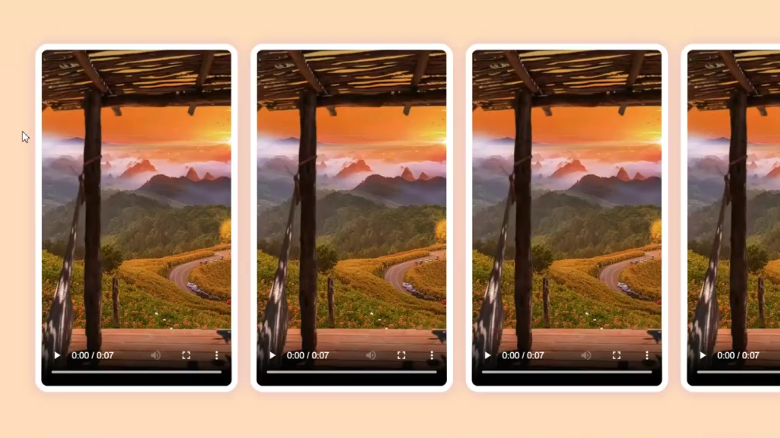
Videoscroll section for video reviews in html css JS these section can help you to interact with users
Videoscroll section for video reviews in html css js
HTML:-
<!DOCTYPE html>
<html lang="en">
<head>
    <meta charset="UTF-8">
    <meta name="viewport" content="width=device-width, initial-scale=1.0">
    <title>Horizontal Scroll Videos</title>
    <link href="https://fonts.googleapis.com/css2?family=DM+Sans:wght@400;500;700&display=swap" rel="stylesheet">
    <link rel="stylesheet" href="styles.css">
</head>
<body>
    <div class="video-container">
        <div class="video-card">
            <video src="./video.mp4" controls></video>
            <div class="info-card">
                <p>Info about the video.</p>
                <div class="flex">
                    <img class="image" src="profile.png">
                    <div class="flex-card">
                        <span>Ganesh</span>
                        <p>CEO</p>
                    </div>
                </div>
            </div>
        </div>
    </div>
    <script src="script.js"></script>
</body>
</html>
CSS:-
body {
    font-family: 'DM Sans', sans-serif;
    margin: 0;
    height: 100vh;
    width: 100%;
    overflow: hidden;
    background: peachpuff;
    display: flex;
    justify-content: start;
    align-items: center;
    padding-left: 90px;
}

.video-container {
    display: flex;
    gap: 20px;
    padding: 10px;
}

.video-card {
    position: relative;
    flex: 0 0 auto;
    width: 300px;
    height: 530px;
    display: flex;
    border: 10px solid #fff;
    background-color: #F5F6F9;
    border-radius: 20px;
    box-shadow: rgba(100, 36, 251, 0.2) 0px 1px 20px 0px;
    transition: width .5s cubic-bezier(.16, 1, .3, 1);
}

video {
    width: 300px;
    height: 100%;
    border-radius: 10px;
    cursor: pointer;
}

.info-card {
    color: #000000;
    padding: 10px;
    border-radius: 10px;
    display: none;
    white-space: normal;
    transform: translateX(-100%);
    transition: transform .5s cubic-bezier(.16, 1, .3, 1), opacity .5s cubic-bezier(.16, 1, .3, 1);
}

.mystyle {
    display: flex !important;
    flex-direction: column;
    justify-content: space-between;
    transform: translateX(0);
}

.image {
    width: 45px;
    height: 45px;
    border-radius: 50%;
    background-color: #fff;
}

.flex {
    display: flex;
    justify-content: start;
    align-items: center;
}

.flex-card {
    display: flex;
    flex-direction: column;
    padding-left: 10px;
    justify-content: center;
}

.flex-card span {
    margin-bottom: 0;
}

.flex-card p {
    margin-top: 0;
    margin-bottom: 0;
}
Javascript:-
const vcards = document.querySelectorAll('.video-card');

vcards.forEach((card) => {
    const infoCard = card.querySelector('.info-card');

    card.addEventListener('mouseover', () => {
        card.style.width = '560px';
        infoCard.classList.add("mystyle");
    });

    card.addEventListener('mouseout', () => {
        card.style.width = '300px';
        infoCard.classList.remove("mystyle");
    });
});
Visit my Portfolio – Ganesh
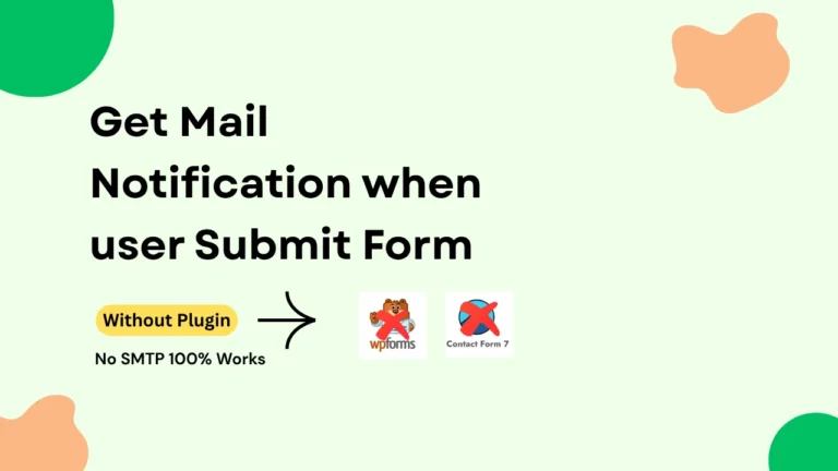
Read here how to create a actuall form with toast notification