Views 491
Form with Toast Message Style Two

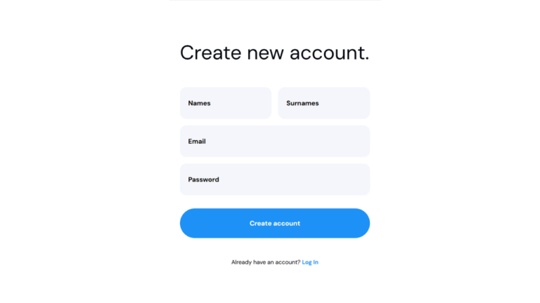
Form with Toast Message Style Two Adding a toast message to a form enhances user experience by providing instant feedback after submission. Toast notifications are non-intrusive, auto-dismissable messages that inform users about successful or failed actions. In this article, we will create a form with a toast message using HTML, CSS, and JavaScript.
You can also read the Login Registration form UIUX Component here
Why Use a Toast Message?
- Instant Feedback: Helps users know if their submission was successful or if an error occurred.
- Non-Intrusive: Appears temporarily and does not disrupt the user’s workflow.
- Modern UI/UX: Provides a sleek and professional look to your form interactions
Steps to Create an Form with Toast
1. Set Up the HTML Structure
We need a basic form structure that includes input fields for username, email, password, and a submit button.
<form class="entry-form bd-coloradd">
    <!-- heading-->
    <h2 class="book-appoinment" style="color:#fff;">Book an Appointment</h2>
              <div class="form-row-entry">
                <input type="text" id="globalname" name="name" placeholder="Name" required />
              </div>
              <div class="form-row-entry">
                <input type="tel" id="globalnumber" name="number" placeholder="Number" required />
              </div>
                <div class="form-row-entry">
                <select id="globalbranch" name="branch" class="dropdown">
                <option value="">Select a Branch</option>
                <option value="gachibowli">Gachibowli</option>
                 <option value="koti">Koti</option>
                <option value="madhapur">Madhapur</option>
               <option value="puppalaguda">Puppalaguda</option>
               </select>
  </div>
                <div class="test-buttons-forwhatsapp">
                    <button class="entry-form_submit globalsubmit-btn"type="submit">Submit</button>
                </div>
             <div class="fixed-messages">
                 <p class="successp">
                     success
                 </p>
                  <p class="errorE">
                     Sorry try again
                 </p>
    </div>
            </form>
2. Style the Form with CSS
Good UI/UX design ensures readability, accessibility, and visual appeal.
input{
        height: 48px;
        border-radius: 12px;
        border: 1px solid #EFE7FF;
        width: 100%;
        padding-left: 12px;
        cursor: pointer;
    }
    select#globalbranch{
        height: 48px;
        border-radius: 12px;
        border: 1px solid #EFE7FF;
        width: 100%;
        padding-left: 12px;
        cursor: pointer;
        font-family: 'DM Sans', sans-serif;
    }
.globalsubmit-btn {
        background: #F3F5FF !important;
        color: #000 !important;
        width: 320px;
        height: 48px;
        border: transparent;
        border-radius: 12px;
        font-size: 16px;
        font-family: 'DM Sans', sans-serif;
    }
    .signup-btn{
        width: 80%;
        height: 52px;
        min-height: 48px;
        color: #FFF;
        background-color: #984CFF;
        border-radius: 12px;
        border-color: transparent;
        margin-top: 6px;
        padding: 0;
        font-family: 'DM Sans', sans-serif;
        font-weight: 600;
        cursor: pointer;
    }
  /* shortcode forms */
.fixed-messages{
}
.successp, .errorE {
  display: none;
		position:fixed;
  bottom: -100px;
  left: 50%;
  transform: translateX(-50%);
  transition: bottom 0.5s ease-out, opacity 0.5s ease-out;
  opacity: 0;
	z-index:1000;
}

.successp.active, .errorE.active {
 display: flex
;
    opacity: 1;
    bottom: 80px;
    position: fixed;
    z-index: 1000;
    background: #000;
    color: white;
    width: 100px;
    justify-content: center;
    align-items: center;
    border-radius: 20px;
    font-size: 20px;
    left: 50%;
    transform: translate(-50%);
}

.book-appoinment{
	font-size: 20px;
	text-align:center;
    margin-bottom: 30px;

}
@media(max-width:768px){
	.for-close{
		width: 40px;
	}
}
.globalsubmit-btn{
	background:#F3F5FF !important;
	color:#000 !important;
}
#globalnumber{
	background:#fff;
}
#globalname{
	background:#fff;
}
#globalbranch{
	background:#fff;
    color:#000;
}
.entry-form {
    display: flex;
    flex-direction: column;
    justify-content: center;
    align-items: center;
    width: 100%;
    height: 100%;
    padding: 20px;
    border-radius: 12px;
}
.form-row-entry {
    width: 320px;
    margin-bottom: 12px;
}
3. Add Functionality with JavaScript
 const form = e.target.closest('form');
 const name = form.querySelector("#globalname").value.trim();
 const number = form.querySelector("#globalnumber").value.trim();
 const branch = form.querySelector("#globalbranch").value;
   const successText = document.querySelector('.successp');
   const errorText = document.querySelector('.errorE');
console.log('Form Data:', data);
const sendToFirstAPI =   fetch("url_orapi", {
   method: "POST",
   body: JSON.stringify(data),
 })
   .then((response) => response.text())
   .then((data) => {
     console.log('first api', data);

//toast active when success with auto hide
       successText.classList.add('active');
        setTimeout(() => {
successText.classList.remove('active');
}, 3000);
     document.querySelector("#globalname").value = "";
     document.querySelector("#globalnumber").value = "";
   })
   .catch((error) => {
     console.error(error);
       errorText.classList.add('active');
       setTimeout(() => {
           errorText.classList.remove('active');
       }, 3000);
   });
Add images you can also take from github repo
Conclusion
This simple yet effective account form ensures a smooth user experience with proper UI/UX design principles. You can further improve it by adding animations, tooltips, or password strength indicators.
Happy coding! 🚀