Views 392
I found these Crazy need help button Interaction with forms and transistion effect ui ux
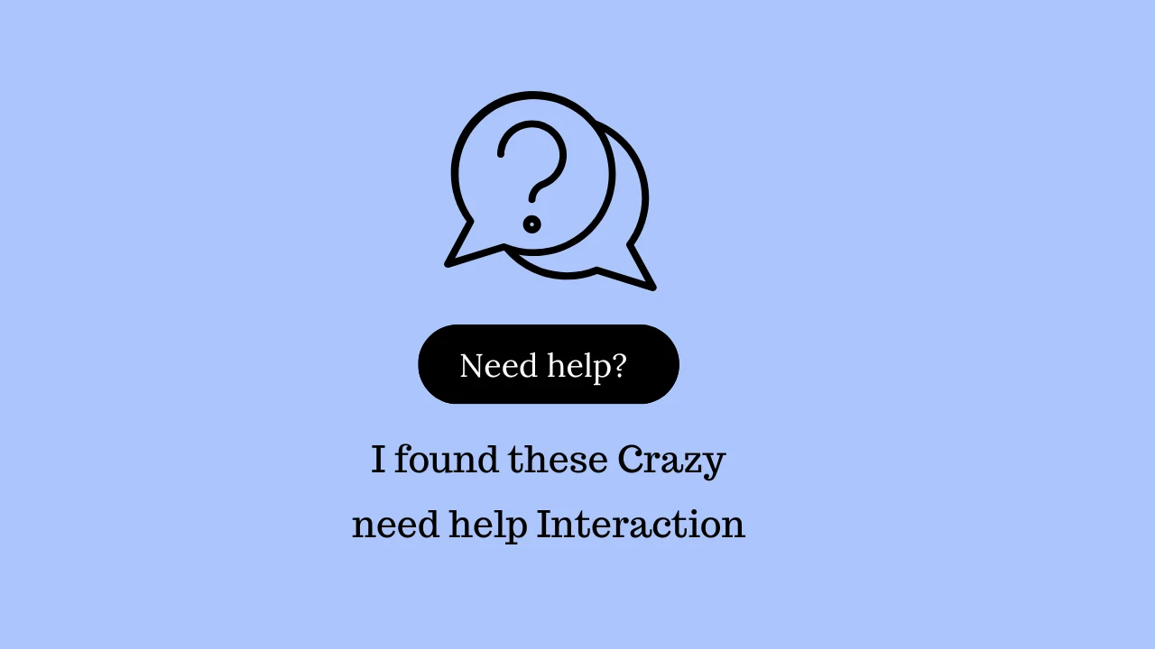
I found these Crazy need help button Interaction with forms and transistion effect ui ux – Interactive elements like a “Need Help” button can enhance user experience by making websites more engaging and accessible. Adding smooth transitions and animations improves usability, making forms feel more intuitive. In this article, we’ll explore how to create an interactive “Need Help” button with engaging effects.
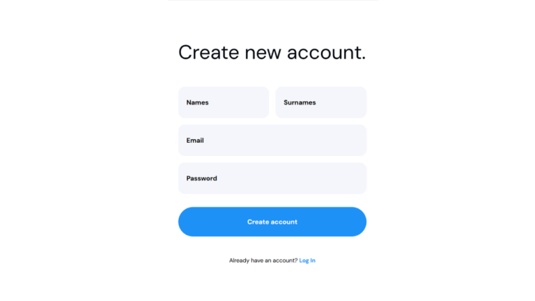
Read my recent registration form with ui and code
I found these Crazy need help button Interaction with forms and transistion effect ui ux for Wordpress
Steps to Create an Interactive Help Button with Transitions
1. Set Up the HTML Structure
We need a simple form with a floating “Need Help?” button.
  <div class="containeryes">
          <button class="help-btn">
            <svg width="32" height="32" viewBox="0 0 32 32" fill="none">
              <path d="M3 17c0-5.6 4.4-10 10-10s10 4.4 10 10m-18 0v6c0 1.2.8 2 2 2h4v-8h-4m14 0v6c0 1.2-.8 2-2 2h-4v-8h4"
                stroke="currentColor"
                stroke-width="2"
                stroke-linecap="round"
                stroke-linejoin="round"/>
            </svg>
            <span class="button-label">Need help?</span>
          </button>
        </div>
2. Style the Form and Help Button with CSS
<style>
    body, .help-btn, .card-header, .card-subtitle, .grid-item, .back-btn, .form-group, .submit-btn {
        font-family: 'DM sans', sans-serif;
    }
    ::view-transition-group(*) {
        animation-duration: .4s;
        animation-timing-function: cubic-bezier(.3,0,0,1);
      }

      ::view-transition-old(icon),
      ::view-transition-new(icon),
      ::view-transition-old(label),
      ::view-transition-new(label) {
        opacity: 1;
      }
      .help-btn,
      .card {
        view-transition-name: help-btn-and-card;
      }
      html:active-view-transition-type(to-card) {
        .button-label,
        .card-label {
          view-transition-name: label;
        }

        .help-btn svg,
        .close-btn svg {
          view-transition-name: icon;
        }
      }

      html:active-view-transition-type(back-to-button) {
        .button-label,
        .card-label {
          view-transition-name: label;
        }

        .help-btn svg,
        .close-btn svg {
          view-transition-name: icon;
        }
      }

      html:active-view-transition-type(back-to-card) {
        .grid-item:first-of-type svg:last-of-type,
        .back-btn svg {
          view-transition-name: icon;
        }

        .grid-item:first-of-type span:first-of-type,
        .back-btn span {
          view-transition-name: label2;
        }
      }

      html:active-view-transition-type(to-ticket-form) {
        .grid-item.active svg:last-of-type,
        .back-btn svg {
          view-transition-name: icon;
        }
        .card-subtitle {
          view-transition-name: card-subtitle;
        }
        &::view-transition-old(card-subtitle) {
          opacity: 0;
        }

        .grid-item.active {
          view-transition-name: active-grid-item;
        }
        &::view-transition-old(active-grid-item) {
          opacity: 0;
        }

        .grid-item.active span:first-of-type,
        .back-btn span {
          view-transition-name: label;
        }
      }


      .help-btn {
        display: flex;
        align-items: center;
        gap: 8px;
        padding: 12px 24px;
        background: white;
        border: 1px solid #ddd;
        border-radius: 100px;
        font-size: 16px;
        color: #666;
        cursor: pointer;
      }

      .card {
        background: white;
        width: 500px;
        padding: 32px;
        border-radius: 16px;
        box-shadow: 0 2px 8px rgba(0,0,0,0.05);
      }

      .card-header {
        display: flex;
        justify-content: space-between;
        align-items: center;
        margin-bottom: 24px;
        color: #27272a;
        font-size: 24px;
        font-weight: 500;
      }

      .card-subtitle {
        color: #71717a;
        font-size: 18px;
        margin-bottom: 32px;
      }

      .close-btn {
        width: 32px;
        height: 32px;
        border: none;
        background: transparent;
        border-radius: 50%;
        cursor: pointer;
        display: grid;
        place-items: center;
      }

      .grid {
        display: grid;
        grid-template-columns: repeat(1, 1fr);
        gap: 8px;
      }

      .grid-item {
        display: flex;
        align-items: center;
        gap: 16px;
        color: #27272a;
        cursor: pointer;
        padding: 16px;
        border: 1px solid #e4e4e7;
        border-radius: 12px;
        font-size: 18px;
        font-weight: 500;
      }

      .grid-item:hover {
        background: #fafafa;
      }

      .icon {
        width: 24px;
        height: 24px;
        stroke: #666;
      }

      .hidden {
        display: none;
      }

      .back-btn {
        background: none;
        border: none;
        cursor: pointer;
        padding: 0;
        color: #71717a;
        align-items: center;
        gap: 8px;
        text-align: left;

        span {
          font-size: 1.2rem;
          display: block;
        }
      }

      .form-group {
        margin-bottom: 24px;
      }

      .form-group label {
        display: block;
        color: #71717a;
        font-size: 18px;
        margin-bottom: 12px;
      }

      .form-group input,
      .form-group textarea {
        width: 100%;
        padding: 16px;
        border: 1px solid #e4e4e7;
        border-radius: 12px;
        font-size: 16px;
        font-family: inherit;
        box-sizing: border-box;
      }

      .form-group textarea {
        min-height: 200px;
      }

      .submit-btn {
        width: 100%;
        padding: 16px;
        background: #000;
        color: white;
        border: none;
        border-radius: 100px;
        font-size: 18px;
        cursor: pointer;
      }

      @keyframes fade-in {
        0% {
          opacity: 0;
          transform: scale(0.8);
        }
        100% {
          opacity: 1;
          transform: scale(1);
        }
      }

      .grid-item,
      .form-group,
      .submit-btn {
        opacity: 0;
        transform-origin: top center;
        animation-name: fade-in;
        animation-duration: 0.1s;
        animation-fill-mode: forwards;
        animation-timing-function: cubic-bezier(.3,0,0,1);
      }

      :is(.grid-item, .form-group, .submit-btn):nth-child(1) {
        animation-delay: 0.2s;
      }

      :is(.grid-item, .form-group, .submit-btn):nth-child(2) {
        animation-delay: 0.25s;
      }

      :is(.grid-item, .form-group, .submit-btn):nth-child(3) {
        animation-delay: 0.35s;
      }

      .container {
        display: grid;
        place-items: center;
        min-height: 100vh;
        margin: 0;
        font-family: system-ui;
        background: #f5f5f5;
      }
</style>
3. Add Interactive Transitions with JavaScript
<script>
    const container = document.querySelector('.container');

    const createButton = /*html*/`
    <button class="help-btn">
      <svg width="32" height="32" viewBox="0 0 32 32" fill="none">
        <path d="M3 17c0-5.6 4.4-10 10-10s10 4.4 10 10m-18 0v6c0 1.2.8 2 2 2h4v-8h-4m14 0v6c0 1.2-.8 2-2 2h-4v-8h4"
          stroke="currentColor"
          stroke-width="2"
          stroke-linecap="round"
          stroke-linejoin="round"/>
      </svg>
      <span class="button-label">Need help?</span>
    </button>
    `;

    const createCard = /*html*/`
    <div class="card">
      <div class="card-header">
        <span class="card-label">Need Help?</span>
        <button class="close-btn">
          <svg width="24" height="24" viewBox="0 0 24 24" fill="none" stroke="currentColor">
            <path d="M18 6L6 18M6 6l12 12" stroke-width="2" stroke-linecap="round"/>
          </svg>
        </button>
      </div>
      <div class="card-subtitle">
        We're here to help 24/7. Choose your preferred contact method below.
      </div>
      <div class="grid">
        <div class="grid-item" data-animation-delay="0.2">
          <svg class="icon" viewBox="0 0 24 24" fill="none">
            <path d="M3 8l7.89 5.26a2 2 0 002.22 0L21 8M5 19h14a2 2 0 002-2V7a2 2 0 00-2-2H5a2 2 0 00-2 2v10a2 2 0 002 2z" stroke="currentColor" stroke-width="2" stroke-linecap="round"/>
          </svg>
          <span>Raise a ticket</span>
          <span style="color: #71717a; font-weight: normal; margin-left: auto">Get a reply within 24 hours</span>
          <svg class="icon" viewBox="0 0 24 24" fill="none">
            <path d="M9 18l6-6-6-6" stroke="currentColor" stroke-width="2" stroke-linecap="round"/>
          </svg>
        </div>

        <div class="grid-item" data-animation-delay="0.25">
          <svg class="icon" viewBox="0 0 24 24" fill="none">
            <path d="M21 11.5a8.38 8.38 0 01-.9 3.8 8.5 8.5 0 01-7.6 4.7 8.38 8.38 0 01-3.8-.9L3 21l1.9-5.7a8.38 8.38 0 01-.9-3.8 8.5 8.5 0 014.7-7.6 8.38 8.38 0 013.8-.9h.5a8.48 8.48 0 018 8v.5z" stroke="currentColor" stroke-width="2"/>
          </svg>
          <span>Live Chat</span>
          <span style="color: #71717a; font-weight: normal; margin-left: auto">2-3 minute wait time</span>
          <svg class="icon" viewBox="0 0 24 24" fill="none">
            <path d="M9 18l6-6-6-6" stroke="currentColor" stroke-width="2" stroke-linecap="round"/>
          </svg>
        </div>

        <div class="grid-item" data-animation-delay="0.35">
          <svg class="icon" viewBox="0 0 24 24" fill="none">
            <path d="M22 16.92v3a2 2 0 01-2.18 2 19.79 19.79 0 01-8.63-3.07 19.5 19.5 0 01-6-6 19.79 19.79 0 01-3.07-8.67A2 2 0 014.11 2h3a2 2 0 012 1.72 12.84 12.84 0 00.7 2.81 2 2 0 01-.45 2.11L8.09 9.91a16 16 0 006 6l1.27-1.27a2 2 0 012.11-.45 12.84 12.84 0 002.81.7A2 2 0 0122 16.92z" stroke="currentColor" stroke-width="2"/>
          </svg>
          <span>Talk to us</span>
          <span style="color: #71717a; font-weight: normal; margin-left: auto">Receive an instant callback</span>
          <svg class="icon" viewBox="0 0 24 24" fill="none">
            <path d="M9 18l6-6-6-6" stroke="currentColor" stroke-width="2" stroke-linecap="round"/>
          </svg>
        </div>
      </div>
    </div>
    `;

    const ticketForm = /*html*/`
    <div class="card">
      <div class="card-header">
        <button class="back-btn">
          <svg width="24" height="24" viewBox="0 0 24 24" fill="none">
            <path d="M15 18l-6-6 6-6" stroke="currentColor" stroke-width="2" stroke-linecap="round"/>
          </svg>
          <span>Raise a ticket</span>
        </button>
      </div>
      <p class="card-subtitle">
        We typically reply within 24 hours. Please provide as much
      </p>
      <form>
        <div class="form-group">
          <label>Email</label>
          <input type="email" required>
        </div>
        <div class="form-group">
          <label>Message</label>
          <textarea required></textarea>
        </div>
        <button type="submit" class="submit-btn">Submit</button>
      </form>
    </div>
    `;

    container.addEventListener('click', (e) => {
      const btn = e.target.closest('button');
      const gridItem = e.target.closest('.grid-item');
      if (!btn && !gridItem) return;

      if (btn?.classList.contains('help-btn')) {
        document.startViewTransition?.({
          update: () => {
            container.innerHTML = createCard;
          },
          types: ['to-card']
        });
      }

      if (btn?.classList.contains('close-btn')) {
        document.startViewTransition?.({
          update: () => {
            container.innerHTML = createButton;
          },
          types: ['back-to-button']
        });
      }

      if (btn?.classList.contains('back-btn')) {
        document.startViewTransition?.({
          update: () => {
            container.innerHTML = createCard;
          },
          types: ['back-to-card']
        });
      }

      if (gridItem?.querySelector('span')?.textContent === 'Raise a ticket') {
        gridItem.classList.add('active');

        document.startViewTransition?.({
          update: () => {
            container.innerHTML = ticketForm;
          },
          types: ['to-ticket-form']
        });
      }
    });
</script>
I found these Crazy need help button Interaction with forms and transistion effect ui ux for Wordpress
- Add Css in style.css file with additionals css i mentioned below
/*Above Code with these */
.containeryes {
		  position:fixed;
		  bottom:40px;
		  left:50%;
		  transform:translate(-50%);
      }
@media(max-width:475px){
	 .card {
    background: white;
        width: 90%;
        margin: auto;
        padding: 16px;
        border-radius: 16px;
        box-shadow: 0 2px 8px rgba(0, 0, 0, 0.05);
        position: absolute;
        bottom: 40px;
        transform: translate(-50%);
        left: 20%;
      }
	.containeryes{
		width: 100%;
        bottom: 40px;
        left: 80%;
        transform: translate(-50%);
        position: fixed;
	}
	.card-header{
		margin-bottom:4px;
		font-size:20px;
	}
	.card-subtitle{
		font-size:14px;
		margin-bottom:16px;
	}
	.grid-item{
		font-size:14px;
	}
}- Add js in script.js or any custom code widget
- Same html also add in custom html widget