Views 468
keep ctas at users thumb: #1 UI/UX Tips
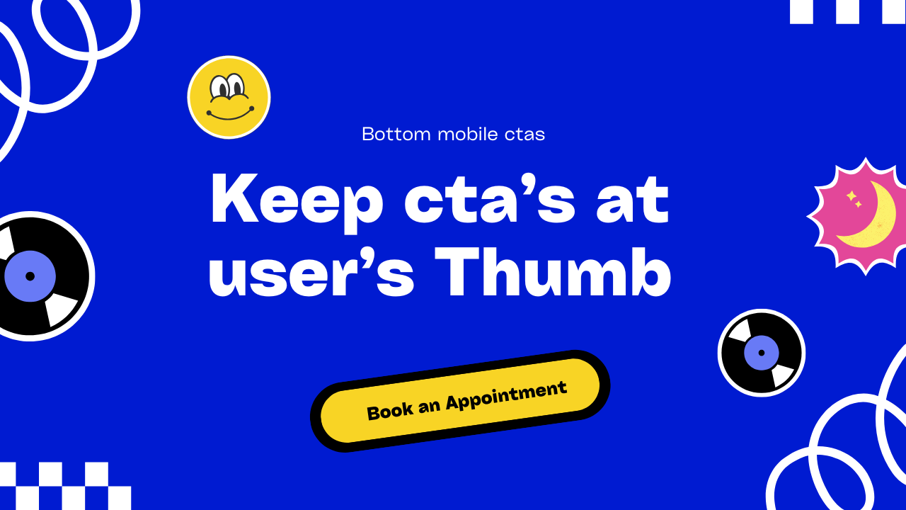
keep ctas at users thumb – In landing pages, it’s essential to position call-to-action (CTA) buttons, such as “Book Appointment” or “Get in Touch,” where users can easily access them—right at their thumb’s natural scrolling spot on mobile screens. Placing CTAs at the bottom of the page not only improves usability but also significantly increases click-through rates and conversions.
To make this even more effective, I’ve created an animated bottom navigation widget for mobile screens. This widget houses multiple CTAs within an expanding menu, conveniently positioned at the bottom for easy thumb access. Check it out below!
keep ctas at users thumb: UI/UX Tips
keep ctas at users thumb: UI/UX Tips
Html code:
<section>
          <div class="bottom-nav-parent">
            <div class="mobile-bottom-nav-ctas-div">
              <ul class="options">
                <li><a href="#">Call Now</a></li>
                <li><a href="#">Find a Doctor</a></li>
                <li><a href="#">Visit Hospital</a></li>
                <li><a href="#">Talk on WhatsApp</a></li>
              </ul>
              <button class="mobile-bottom-nav-ctas">Book an Appointment</button>
            </div>
          </div>
        </section>
CSstyles:
  @media (max-width:475px) {
    .mobile-bottom-nav-ctas-div{
        width: 90% !important;

    }

  }
  .mobile-bottom-nav-ctas-div{
	  z-index:1000;
    width:375px;
    height:60px;
    padding: 5px;
    border-radius: 50px;
    background: #a8c0ff;  /* fallback for old browsers */
background: -webkit-linear-gradient(to right, #3f2b96, #a8c0ff);  /* Chrome 10-25, Safari 5.1-6 */
background: linear-gradient(to right, #3f2b96, #a8c0ff); /* W3C, IE 10+/ Edge, Firefox 16+, Chrome 26+, Opera 12+, Safari 7+ */

    position:fixed;
    bottom:20px;
    left:50%;
    transform:translateX(-50%);
  }
    .mobile-bottom-nav-ctas-div ul {
      display: none;
      list-style: none;
      padding: 0;
      margin: auto;
      text-align: center;
      opacity:0;
    }

    .mobile-bottom-nav-ctas-div ul li {
      width:100%;
      justify-content:center;
      align-items:center;
      padding:14px 28px;
      font-size:18px;
    font-weight:500;
    letter-spacing:-0.3px;
      border:1px solid #ccc;
      border-radius: 50px;
		transition: transform .3s, color .3s, border-color .3s, box-shadow 3s;
		transform-style: preserve-3d;
    }
  .mobile-bottom-nav-ctas{
    width:100%;
    height:50px;
    background:#ffffff;
    color:#000000;
    font-size:18px;
    font-weight:500;
    letter-spacing:-0.3px;
    border-radius:50px;
    z-index:100;
    border:none;
    cursor:pointer;
  }
  .mobile-bottom-nav-ctas-div ul li a{
    color: white;
    text-decoration: none;
    font-size: 16px;
  }
.mobile-bottom-nav-ctas-div ul li:hover{
	background:#fff;
	color:#000;
}
.mobile-bottom-nav-ctas-div ul li:hover a{
	color:#000;
}
Javascript :-
/* botttom menu ctas nav */
const moptions = document.querySelector('.options');
const optionBox = document.querySelector('.mobile-bottom-nav-ctas-div');
const optionbutton = document.querySelector('.mobile-bottom-nav-ctas');

optionbutton.addEventListener('click', function () {
    if (moptions.style.display === 'none' || moptions.style.display === '') {
        // Show and animate the list
        moptions.style.display = 'flex';
        gsap.to(optionBox, {
            duration: 0.3,
            height: "340px",
            padding: '10px',
            bottom: 0,
            borderRadius: "2rem 2rem 0 0",
            ease: "power1.inOut",
        });
		gsap.to(optionbutton, {
			duration: 0.3,
			marginTop: '7px'
		});
        gsap.to(moptions, {
            duration: 0.3,
            width: '100%',
            opacity: 1,
            flexDirection: 'column',
            justifyContent: 'center',
            alignItems: 'center',
            gap: '10px'
        });
    } else {
        // Hide and animate back the list
        gsap.to(optionBox, {
            duration: 0.3,
            height: "70px",
            borderRadius: "50px",
            ease: "power1.inOut",
            onComplete: () => {
                moptions.style.display = 'none';
            },
        });
		gsap.to(optionbutton, {
			duration: 0.3,
			marginTop: '0'
		});
        gsap.to(moptions, {
            opacity: 0,
            display: 'none'
        });
    }
});
Feeling Crazy? share your feedback below in comment box
Follow me from here My X( twitter account )
You can read more interesting ui ux component blogs here. Auto tab switching components clean and sophisticated ui read here.