Views 416
Free Dynamic Bottom Navigation with Swipe Up and Swipe Down Feature: HTML and CSS

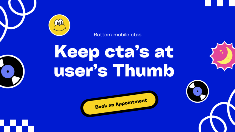
Bottom Navigation with Swipe Up and Swipe Down Features Creating an intuitive and interactive navigation system is crucial for enhancing user experience on your website. I’ve developed a dynamic bottom navigation menu that features swipe up and swipe down functionality using HTML and CSS. This sleek navigation solution is available for free, with a live demo and the complete code on GitHub.
Why use a bottom Bottom Navigation?
Bottom navigation menus are becoming increasingly popular in modern web design, especially for mobile devices. Here’s why this dynamic bottom navigation is a great addition to your site:
- User-Friendly: Easily accessible and intuitive for users on mobile devices.
- Interactive: Swipe up and swipe down animations make the navigation engaging.
- Customizable: Easily modify the HTML and CSS to fit your website’s design.
Features of This Dynamic Bottom Navigation
- Swipe Up and Swipe Down: Smooth animations for opening and closing the navigation menu.
- Responsive Design: Optimized for both desktop and mobile views.
- Clean and Modern Look: Sleek design that complements contemporary web aesthetics.
Live Demo and Code
Before we dive into the details, you can check out the live demo and access the full code on GitHub:
- Live Demo: See the dynamic bottom navigation in action.
- GitHub Code: Access the complete code for this project.
Note :- Open Demo link in mobile for better experience .
The Fallen( webbee)
How to Implement the Dynamic Bottom Navigation
1. HTML Structure
Start by setting up the basic HTML structure for the bottom navigation menu.
<section  id="bottom-bar">
    <div class="mobile">
    <div class="action"><p class="close" style="">
        <img loading="lazy" class="img" src="https://neilpatel.com/wp-content/themes/neilpatel/images/close-t.svg" width="12" height="12" alt="Close"></p>
        <p class="swipe swipe-up" data-swipe-threshold="5" data-swipe-timeout="1000" style="">
            <span class="swipe-text">
                <img width="15" height="15" src="https://img.icons8.com/external-inkubators-detailed-outline-inkubators/25/external-up-arrow-arrows-inkubators-detailed-outline-inkubators-2.png" alt="external-up-arrow-arrows-inkubators-detailed-outline-inkubators-2"/>
               <span> Swipe Up to Get More Patients!</span> </span></p></div>
</div>
<div  class="custom-bottom-nav"  id="custombtmnav">
<input type="radio" name="nav" id="item1" class="check" checked />
    <input type="radio" name="nav" id="item2" class="check" />
    <input type="radio" name="nav" id="item3" class="check" />
    <input type="radio" name="nav" id="item4" class="check" />
    <div class="center">
      <div class="nav-bar">
        <label
          for="item1"
          style="--color1: rgb(233, 215, 243); --color2: rgb(91, 55, 183)"
        >
          <span class="material-icons-outlined"> home </span>
          Home
        </label>

        <label
          for="item2"
          style="--color1: rgb(246, 214, 238); --color2: rgb(201, 55, 157)"
        >
          <span class="material-icons-outlined"> favorite_border </span>
          Favourite
        </label>

        <label
          for="item3"
          style="--color1: rgb(251, 239, 211); --color2: rgb(230, 169, 25)"
        >
          <span class="material-icons-outlined"> search </span>
          Search
        </label>

        <label
          for="item4"
          style="--color1: rgb(209, 235, 239); --color2: rgb(17, 148, 170)"
        >
          <span class="material-icons-outlined"> person </span>
          Profile
        </label>
      </div>
    </div>
</div>
</section>
2. CSS Styling
Style the bottom navigation menu and add the swipe up and swipe down animations using CSS.
    body {
  margin: 1px;
  padding: 0;
  background: linear-gradient(60deg, #c9b2c5, #afb6e5);
  /* Adjust display as needed, but typically not required for body */
  --display-element: inherit; /* Not used for body, can be removed */
  --desktop-display-element: inherit; /* Not used in this context, can be removed */
        width:100%;
        height:100vh;
}


    @media (max-width: 500px) {
        #bottom-bar .mobile .action {
            align-items: flex-end;
            display: flex;
        }
        #bottom-bar .mobile .action .close {
            margin: 19px 15px;
        }
        #bottom-bar .mobile .action .close img {
            max-width: none;
        }
        #bottom-bar .mobile .swipe-up {
            padding-left: 0;
            padding-right: 42px;
            width: 100%;
        }
        #bottom-bar .mobile .swipe {
            cursor: pointer;
            text-align: center;
        }
        #bottom-bar .mobile .swipe-up .swipe-text {
            font-size: 18px;
            font-weight: 500;
            line-height: 1.6666666667;

        }
        #bottom-bar .mobile .swipe .swipe-text {
            display: inline-block;
            position: relative;
        }
        #bottom-bar {
            bottom: 0;
            position: absolute;
            width: 100%;
            z-index: 999;
        }
        #bottom-bar .mobile {
            background: #fff;
            border-top-left-radius: 30px;
            border-top-right-radius: 30px;
            box-shadow: 0 0 40px rgba(0, 0, 0, .12);
            touch-action: none;
            width: 100%;
        }
        .swipe-text{
            display: flex !important;
            flex-direction: column;
            justify-content: center;
            align-items: center;
        }
        p{
            margin: 0;
        }

        .check {
            display: none;
          }
          .nav-bar {
            width: 100%;
            height: auto;

            background: white;
            display: flex;
            align-items: center;
            justify-content: space-around;
            font-family: poppins;

          }
          .nav-bar label {
            display: flex;
            align-items: center;
            justify-content: left;
            font-size: 15px;
            font-weight: 500;
            padding: 10px;
            border-radius: 8mm;
            max-width: 32px;
            overflow: hidden;
            transition: 0.35s ease-out;
          }
          .nav-bar label span {
            font-size: 32px;
            margin-right: 10px;
          }
          .nav-bar label:hover {
            background: rgba(0, 0, 0, 0.1);
          }

/* Apply hover styles to labels */
.nav-bar label[for="item1"]:hover,
.nav-bar label[for="item2"]:hover,
.nav-bar label[for="item3"]:hover,
.nav-bar label[for="item4"]:hover {
  background: var(--color1);
  color: var(--color2);
  max-width: 150px;
}

/* Change the background color of the .center container based on which label is hovered */
.nav-bar label[for="item1"]:hover ~ .center {
  background: rgb(91, 55, 183);
}
.nav-bar label[for="item2"]:hover ~ .center {
  background: rgb(201, 55, 157);
}
.nav-bar label[for="item3"]:hover ~ .center {
  background: rgb(230, 169, 25);
}
.nav-bar label[for="item4"]:hover ~ .center {
  background: rgb(17, 148, 170);
}
.custom-bottom-nav{
    display: none;
}
.center{
   width: 100%;
   overflow:hidden;
   height: 50px;
}

    }
3. JavaScript Functionality
Add JavaScript to handle the swipe up and swipe down animations for the bottom navigation menu.
    document.querySelector('.swipe-up').addEventListener('touchstart', handleTouchStart, false);
    document.querySelector('.swipe-up').addEventListener('touchmove', handleTouchMove, false);

    let yDown = null;

    function handleTouchStart(evt) {
        const firstTouch = evt.touches[0];
        yDown = firstTouch.clientY; // Get the vertical position of the touch
    }

    function handleTouchMove(evt) {
        if (!yDown) {
            return;
        }

        let yUp = evt.touches[0].clientY;
        let yDiff = yDown - yUp;

        // Setting a threshold for swipe action to be considered valid
        if (yDiff > 50) { // Swipe up
            document.getElementById('custombtmnav').style.display = 'block';
            yDown = null; // Resetting yDown to prevent multiple triggers
        } else if (yDiff < -50) { // Swipe down
            document.getElementById('custombtmnav').style.display = 'none';
            yDown = null; // Resetting yDown to prevent multiple triggers
        }
    }
    function handleTouchStart(evt) {
        evt.preventDefault(); // Prevent scrolling when touching the swipe area
        const firstTouch = evt.touches[0];
        yDown = firstTouch.clientY;
    }

    function handleTouchMove(evt) {
        evt.preventDefault(); // Prevent scrolling when moving touch
        if (!yDown) {
            return;
        }

        let yUp = evt.touches[0].clientY;
        let yDiff = yDown - yUp;

        if (yDiff > 50) {
            document.getElementById('custombtmnav').style.display = 'block';
            yDown = null;
        } else if (yDiff < -50) {
            document.getElementById('custombtmnav').style.display = 'none';
            yDown = null;
        }
    }
How It Works
- HTML Structure: The HTML includes a button to toggle the navigation and links for the navigation items.
- CSS Styling: The CSS handles the positioning, styling, and animations for the navigation menu.
- JavaScript Functionality: The JavaScript function toggles the
.nav-openclass to animate the menu.
Putting It All Together
Once you have the HTML structure, CSS styling, and JavaScript functionality in place, your dynamic bottom navigation with swipe up and swipe down feature should work seamlessly. This setup provides an interactive and user-friendly navigation experience for your site visitors.
Conclusion
Adding a dynamic bottom navigation menu with swipe functionality can significantly improve the user experience on your website. This tutorial has shown you how to implement such a feature using HTML, CSS, and JavaScript. Feel free to customize the styles and functionality to match your specific needs.
Happy coding!